Showing posts with label colour. Show all posts
Monday, 4 March 2013
oooo I'm all shook up!
Labels:
accessories,
accessory,
AnOther,
AnOther magazine,
art,
bag,
colour,
fashion,
food,
food experience,
food styling,
milkshake,
milkshakes,
photo editing,
photo shoot,
photoshop,
shoes,
styling,
trend
Edits
Here are the original images I decided to use and their edited versions. I brightened up the images and changed the vibrance, contrast and saturation. I tried to keep the pastel theme apparent through the shoot but I needed to make sure the colours didn't look to washed out. I am pleased with how they turned out and I now need to figure out how I am going to lay them out for an editorial. I am considering doing a title page as well as an opening for the editorial.
AnOther
The magazine I have chosen for my editorial is AnOther magazine because they well known for studio shoots and I think they display their still life editorials in a very interesting way. Going through AnOther i found the page layouts very peculiar and there seemed to be no real uniformity or constancy to them. Some pages were full bleed where as some where collaged with a few images. Going through some back issues and images I looked at online, AnOther tend to use a slight grey tint on their backgrounds which I feel gives a bit more depth to the photograph rather than using a bright white background,
Example of AnOther credits
Example of the mis matched layouts.
I really like how they have portrayed the images in this editorial and I think I am going to do something similar. Although there is a lot of white space it still looks sleek and professional.
shake it, shake it shake it like a Polaroid picture
Here are the milkshakes I am using for my shoot. I decided to use different glasses for each shake to create a more interesting aesthetic.
The green milkshake is an Avocado shake, the pink is a strawberry milkshake, the purple is a blackberry shake and the blue is a bubblegum millions ice cream milkshake.
Apart from the avocado milkshake, they were all made using ice cream and milk then adding either strawberries, blackberries and blue millions until I go the desired colour.
The Avocado recipe was slightly different
Ingredients:
1 ripe Haas (dark-skinned) avocado, peeled and pitted
4 tablespoons sweetened condensed milk
1 cup cold milk, more or less depending on thickness desired
few drops orange extract, or some vanilla, rum or coffee (optional)
crushed ice and additional sweetened condensed milk for serving
Directions:
Combine everything in a blender and blend until very smooth (if you like you can add some of the ice here to give it more of a frosty milkshake character). Fill two glasses with additional ice. Drizzle a little more sweetened condensed milk over the ice before filling each with the avocado shake. Give it a quick stir and serve promptly, accompanied by a spoon.
Notes:
Rich and creamy drinks made from avocados and sweetened milk are classic ways of enjoying this fruit across Asia, and are really delicious once you get past any initial ‘this is weird!’ reaction. Watch out for over-ripe avocados, however, whose slightly rancid taste will spoil the drink. The best avocados to use are those that gently yield to pressure, that are free from dark blotches inside the fruit. If you have any doubts, taste a piece first. Also, I really love the citrusy note that a little bit of orange essence adds, but the avocado also has enough flavor to stand up on its own, or to other dessert flavorings like vanilla and dark rum. Or try a shot of espresso, as they like it in Indonesia. p.s. Did I mention this drink is rich?
Recipe from: http://www.travelerslunchbox.com/journal/2006/5/31/the-secret-life-of-avocados.html
Accessory Creation
Here are my accessories. I spray painted them a few times to make sure the colours were bold enough to show up on camera but still fitted into my pastel trend. My next job is going to be finding milkshakes that match each accessory.
Labels:
accessories,
accessory,
bag,
colour,
fashion,
fashion styling,
pastel,
shoes,
styling
Spray paint
Here are the spray paints I am going to use to create the pastel colours for my accessories. I chose a slight gloss finish on the paint so that when I am doing my shoot they items will have a nice sheen which replicates the materials they would've been made from originally.
Lenor Blue
Lavender Purple
E2E Green
Miss Piggy Pink
Concept
After looking at my trend boards and my research I feel my pastel trend fits in with my research into milkshakes. I feel as I have been focused on colour throughout my research these two concepts are very closely linked. My initial idea was to display the accessory item next to a food item with similar colours and include the recipe at the bottom but I have moved on and developed my idea to make it more suitable for a fashion editorial. I went back through my photo's from Manchester and looked again at the 17th/18th Century garments and noticed they were all quite pastely soft colours due to the technology and knowledge of how to dye clothes at the time. I looked again at these when going through the accessories I want to use for my shoot. I have tried to incorporate the two as well as considering my food experiences. I really decided on milkshakes when I was going through the trends as I kept seeing pastel pinks which reminded me of the shake I had at the american diner In Camden. If you compare the colours of the accessories I have chosen to the photos from Platt Hall you can definitely see the links and where I got my colour pallet from.
Charlotte Olympia
Jimmy Choo
Nancy Gonzalez
Gryson
All accessory images from http://www.style.com
Labels:
accessories,
accessory,
bag,
colour,
fashion,
fashion styling,
pastel,
shoes
Trend alert
I decided to look at s/s13 for my accessories as I felt there was a lot more to chose from than a/w13. I have compiled 3 mood boards of the trends I felt were strong. I really like the contrast trend as it's bold and black&white are always on trend and there is so much that they would work with but I don't feel my research, which is based on colour would work but I feel for my research pastel works much better. I think after looking at my research I am going to link pastel colours to milkshakes. I think this is a strong link to my research and I can produce something that relates to the trends.
Food, Fashion, Colour
Here are two mood boards I have created where I have looked at the colours in the outfits/accessories and found food that incorporates those colours giving you a visual link between the two and aesthetically you can notice the similarities. This links in with my original concept of displaying the accessory and then the food next to it to show the comparison with the colours. As you can see I have focused on 2 collections here instead of trends so that I could show a variety I tried to focus on mainly the accessories as well as including some of the outfits.
American diner research cont.
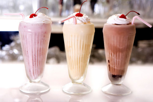
After going through all my London research I decided to focus mainly on the american diner experience. The thing that influenced me the most was the milkshakes. As a group of us went to the diner, we all got milkshakes and the colours intrigued me especially how they contrasted with the white whipped cream. I want to experiment with different ways of displaying the shakes, using different glasses and having the shakes being different consistency.
Photo from: http://www.sheknows.com/food-and-recipes/articles/810811/yum-milkshake-recipes
Photo from: http://mymegabite.co.uk/new_orderorder_takeaway_in_Peterborough_try_Milkshakes%20%20%20%20Cold%20Drinks%20%20%20%20Juices%20%20%20%20Hot%20Drinks%20%20%20%20Ice%20Cream%20%20%20%20Slush%20Puppie_c_23363.htm
Photo from: http://www.thekitchn.com/soda-fountain-recipe-banana-cream-pie-milkshake-170201
Photo from: http://madcookingfusions.com/chocolate-vanilla-milkshake-recipe-turn-simple-into-exotic/
Subscribe to:
Posts (Atom)