Monday, 4 March 2013

Food, Fashion, Colour

Here are two mood boards I have created where I have looked at the colours in the outfits/accessories and found food that incorporates those colours giving you a visual link between the two and aesthetically you can notice the similarities. This links in with my original concept of displaying the accessory and then the food next to it to show the comparison with the colours. As you can see I have focused on 2 collections here instead of trends so that I could show a variety I tried to focus on mainly the accessories as well as including some of the outfits.


American diner research cont.

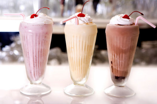
After going through all my London research I decided to focus mainly on the american diner experience. The thing that influenced me the most was the milkshakes. As a group of us went to the diner, we all got milkshakes and the colours intrigued me especially how they contrasted with the white whipped cream. I want to experiment with different ways of displaying the shakes, using different glasses and having the shakes being different consistency. 

Photo from: http://www.sheknows.com/food-and-recipes/articles/810811/yum-milkshake-recipes
Photo from: http://mymegabite.co.uk/new_orderorder_takeaway_in_Peterborough_try_Milkshakes%20%20%20%20Cold%20Drinks%20%20%20%20Juices%20%20%20%20Hot%20Drinks%20%20%20%20Ice%20Cream%20%20%20%20Slush%20Puppie_c_23363.htm
Photo from: http://www.thekitchn.com/soda-fountain-recipe-banana-cream-pie-milkshake-170201
Photo from: http://madcookingfusions.com/chocolate-vanilla-milkshake-recipe-turn-simple-into-exotic/

Sunday, 3 March 2013

Selfridges


So in London I went to the food hall at Selfridges, although not as grand as Harrods it still offers a wide selection of culinary delights. Unfortunately I got told off for taking photos as soon as my camera and phone came out. It shows what an important part of daily life food is playing as department stores are now having 'designer' food boutiques so to speak within the store, for those people who can afford to do their weekly shop or those who are getting something special and specific. The contrast of food available was amazing with their being a fresh fish counter to asian spices. The diversity is what makes these department store food outlets work in my opinion.


Photo from: http://www.arabicafoodandspice.com/where-to-buy/selfridges
Photo from: http://adafina.co.uk/selfridges
Photo from: http://www.microlock.co.uk/installations/selfridges.html

Peter Lippmann

Peter Lippmann is someone I stumbled across while researching accessories and food, his pictures for Louboutin's look books had my jaw dropping, I thought they were beautiful. They were so different to what I would expect from Louboutin as they aren't glamourous or sleek instead using nature, food and water to display these high end items with such a reputation is such a juxtaposition I think it works nicely.


From finding his website I then stumbled onto other work he has done.
These were from the NY Times

These two were from the London Sunday Times


Here is some of Lippmann's personal work. I really like the background in these as you can still see the shadows but the background is clean and sleek and there is a warm tone to his work.


To see more of Peter Lippmann's work go to: http://peterlippmann.com

Breakfast


All shook up

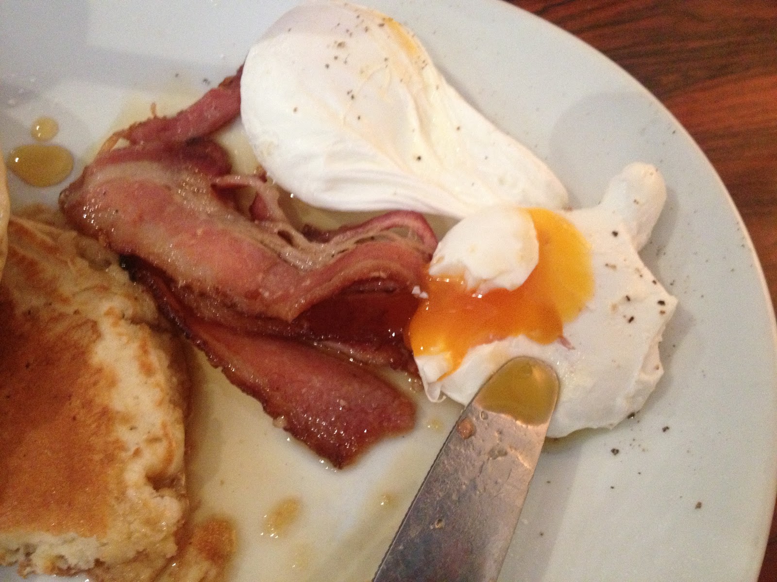
On my 2nd day in London I went to The Diner in camden. The Diner is an American themed eatery which serves all the classic breakfast items and burgers. I decided to go for pancakes with bacon, poached eggs and maple syrup to give me a nice range of colours in my food. I also went with a very typical american classic, a strawberry shake. The shake came in a classic glass but also had a metal tumblr with even more shake in it so that you could top it up! Overall I enjoyed the mix of foods, the sweetness of the maple syrup with the saltiness of the bacon and the fluffiness of the buttermilk pancakes!


Tate Modern

While in London I went to the Tate Modern. I have been to the Tate several times but I love wondering around again and again as you always spot things you may have missed before and I get to see old favourites. Here are a few things that struck me on this particular visit.


Friday, 1 March 2013

Imano:VIdeo


Here are two videos showing my experience at the Imano restaurant in London. These videos show the use of interactive technology in a dining experience.

Tuesday, 26 February 2013

Colour Charts


Imano: Food Experience

For my main food experience while in London I went to the interactive restaurant Imano, a Japanese restaurant in the trendy part of soho. The idea behind the restaurant is that you can see the items on the menu projected onto your plate before you order. With technology advancing everyday why not take this and apply it to something so fundamental like eating. You are guaranteed the food/drinks you order 15 minutes after placing your order. The way you control this interactive system is with a track pad on each table which you then use to control the menu. Other options you can do while waiting for your food is to change the image of your 'tablecloth' as yes that is projected too! You can also watch the 'chef cam' and watch in real time the chefs cooking and preparing your food. A great option that was available was to play games, i.e. battleships and other puzzle based games.

For my meal I had a passionfruit martini, squid and spring onion goyza's, Japanese coleslaw and vegetable tempura. I wanted to look at the colour of the food and the garnishes and how they worked together and how could I work with them. 


Wellcome Collection

One of the galleries I went to while in London was the Wellcome Collection, where the exhibition 'Death: A Self-Portrait' was showing. Although quite a morbid exhibition, I took away quite a lot especially how the artists used colours to portray their thoughts on death. The South American/Mexican artists tended to portray death with bright reds and yellows, in order to celebrate the deceased's life. Where as the more European artists tended to use very dull, and bland colours to show more the intimate feelings that surround death.
South American 'shrine' commemorating death
You can see how the artist has used more dull and subtle colours even when using reds and yellows.

Wednesday, 20 February 2013

Bubble tea

During my visit to London, I was set to have a few food experiences. One of the first experiences I had was Bubble tea. Bubble tea has made a big splash in the UK recently. It's a fruit flavoured green tea which you can have hot or cold, there are black jelly balls in the bottom of the tea. You can then chose to add fruit juiced filled 'boboa' balls. I chose to have a Passion fruit cold tea with mango filled boboa. The first sip tasted refreshing and then as I sucked up one of the the black jelly balls I found the texture as I chewed it very odd. I decided to give them another go. Comparing that to the mango filled balls was very odd as the mango balls were very sweet and were pleasant to eat where as I kept trying to chew the black jelly balls I started to really dislike them. In the end I ended up just swallowing the black balls whole so that I didn't have to taste them. My friend had a hot strawberry tea, which was a stark contrast to mine, the black jelly balls melted in hers and somehow they tasted even worse! However I think the strawberry tea was nicer hot and you could taste the underlying green tea very nicely.


Borough Market

Going round Borough Market, what really stuck out to me was the colours, the produce all looked fresh to me and so inviting. I was really interested in how the colours worked together when put side by side.  For example the wild mushrooms, the colours interact with each other and create an interesting mix which I'd like to use as inspiration for looking at collections. I also liked the desserts as the pale colours worked rally well with the richness of the caramels.