Showing posts with label food styling. Show all posts

Monday, 4 March 2013

oooo I'm all shook up!


 Here are my final images in the order I want them displayed. I decided to go with the layout I like in AnOther magazine which I mentioned in a previous blog post as I think i's an interesting way to display landscape images and I think it also makes them stand out more. I have added credits in the style of AnOther to make it really fit in to my chosen publication. I am pleased with how my images turned out and I think my research backs up my direction and narrative. I found this brief challenging as it was still life and was very unsure where I could take it but I am happy with the work I produced and think it fits the brief well.


Shake up your style

I decided to create a title page for my editorial. I used the shot of the strawberry milkshake and then brightened it but making sure the background wasn't too white, as I still want some depth. Then using the font 'Futura' I thought of a name for my editorial 'All Shook Up' and and added the tagline "Shake up your style this season' I wanted to keep it simple so that it was in keeping with AnOther magazine and I think it achieved that as well as linking to my editorial.


Edits

Here are the original images I decided to use and their edited versions. I brightened up the images and changed the vibrance, contrast and saturation. I tried to keep the pastel theme apparent through the shoot but I needed to make sure the colours didn't look to washed out. I am pleased with how they turned out and I now need to figure out how I am going to lay them out for an editorial. I am considering doing a title page as well as an opening for the editorial.


shake it, shake it shake it like a Polaroid picture


Here are the milkshakes I am using for my shoot. I decided to use different glasses for each shake to create a more interesting aesthetic.
The green milkshake is an Avocado shake, the pink is a strawberry milkshake, the purple is a blackberry shake and the blue is a bubblegum millions ice cream milkshake.

Apart from the avocado milkshake, they were all made using ice cream and milk then adding either strawberries, blackberries and blue millions until I go the desired colour.

The Avocado recipe was slightly different


Ingredients:
1 ripe Haas (dark-skinned) avocado, peeled and pitted
4 tablespoons sweetened condensed milk
1 cup cold milk, more or less depending on thickness desired
few drops orange extract, or some vanilla, rum or coffee (optional)
crushed ice and additional sweetened condensed milk for serving
Directions:
Combine everything in a blender and blend until very smooth (if you like you can add some of the ice here to give it more of a frosty milkshake character). Fill two glasses with additional ice. Drizzle a little more sweetened condensed milk over the ice before filling each with the avocado shake. Give it a quick stir and serve promptly, accompanied by a spoon.
Notes:
Rich and creamy drinks made from avocados and sweetened milk are classic ways of enjoying this fruit across Asia, and are really delicious once you get past any initial ‘this is weird!’ reaction. Watch out for over-ripe avocados, however, whose slightly rancid taste will spoil the drink. The best avocados to use are those that gently yield to pressure, that are free from dark blotches inside the fruit. If you have any doubts, taste a piece first. Also, I really love the citrusy note that a little bit of orange essence adds, but the avocado also has enough flavor to stand up on its own, or to other dessert flavorings like vanilla and dark rum. Or try a shot of espresso, as they like it in Indonesia. p.s. Did I mention this drink is rich?

Recipe from: http://www.travelerslunchbox.com/journal/2006/5/31/the-secret-life-of-avocados.html

Food, Fashion, Colour

Here are two mood boards I have created where I have looked at the colours in the outfits/accessories and found food that incorporates those colours giving you a visual link between the two and aesthetically you can notice the similarities. This links in with my original concept of displaying the accessory and then the food next to it to show the comparison with the colours. As you can see I have focused on 2 collections here instead of trends so that I could show a variety I tried to focus on mainly the accessories as well as including some of the outfits.


American diner research cont.

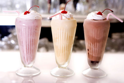
After going through all my London research I decided to focus mainly on the american diner experience. The thing that influenced me the most was the milkshakes. As a group of us went to the diner, we all got milkshakes and the colours intrigued me especially how they contrasted with the white whipped cream. I want to experiment with different ways of displaying the shakes, using different glasses and having the shakes being different consistency. 

Photo from: http://www.sheknows.com/food-and-recipes/articles/810811/yum-milkshake-recipes
Photo from: http://mymegabite.co.uk/new_orderorder_takeaway_in_Peterborough_try_Milkshakes%20%20%20%20Cold%20Drinks%20%20%20%20Juices%20%20%20%20Hot%20Drinks%20%20%20%20Ice%20Cream%20%20%20%20Slush%20Puppie_c_23363.htm
Photo from: http://www.thekitchn.com/soda-fountain-recipe-banana-cream-pie-milkshake-170201
Photo from: http://madcookingfusions.com/chocolate-vanilla-milkshake-recipe-turn-simple-into-exotic/

Sunday, 3 March 2013

Selfridges


So in London I went to the food hall at Selfridges, although not as grand as Harrods it still offers a wide selection of culinary delights. Unfortunately I got told off for taking photos as soon as my camera and phone came out. It shows what an important part of daily life food is playing as department stores are now having 'designer' food boutiques so to speak within the store, for those people who can afford to do their weekly shop or those who are getting something special and specific. The contrast of food available was amazing with their being a fresh fish counter to asian spices. The diversity is what makes these department store food outlets work in my opinion.


Photo from: http://www.arabicafoodandspice.com/where-to-buy/selfridges
Photo from: http://adafina.co.uk/selfridges
Photo from: http://www.microlock.co.uk/installations/selfridges.html

Peter Lippmann

Peter Lippmann is someone I stumbled across while researching accessories and food, his pictures for Louboutin's look books had my jaw dropping, I thought they were beautiful. They were so different to what I would expect from Louboutin as they aren't glamourous or sleek instead using nature, food and water to display these high end items with such a reputation is such a juxtaposition I think it works nicely.


From finding his website I then stumbled onto other work he has done.
These were from the NY Times

These two were from the London Sunday Times


Here is some of Lippmann's personal work. I really like the background in these as you can still see the shadows but the background is clean and sleek and there is a warm tone to his work.


To see more of Peter Lippmann's work go to: http://peterlippmann.com

Breakfast


All shook up

On my 2nd day in London I went to The Diner in camden. The Diner is an American themed eatery which serves all the classic breakfast items and burgers. I decided to go for pancakes with bacon, poached eggs and maple syrup to give me a nice range of colours in my food. I also went with a very typical american classic, a strawberry shake. The shake came in a classic glass but also had a metal tumblr with even more shake in it so that you could top it up! Overall I enjoyed the mix of foods, the sweetness of the maple syrup with the saltiness of the bacon and the fluffiness of the buttermilk pancakes!


Friday, 1 March 2013

Imano:VIdeo


Here are two videos showing my experience at the Imano restaurant in London. These videos show the use of interactive technology in a dining experience.